How can I learn more? Here I document examinations, outside of work.
Eggs and households, eggs in households?
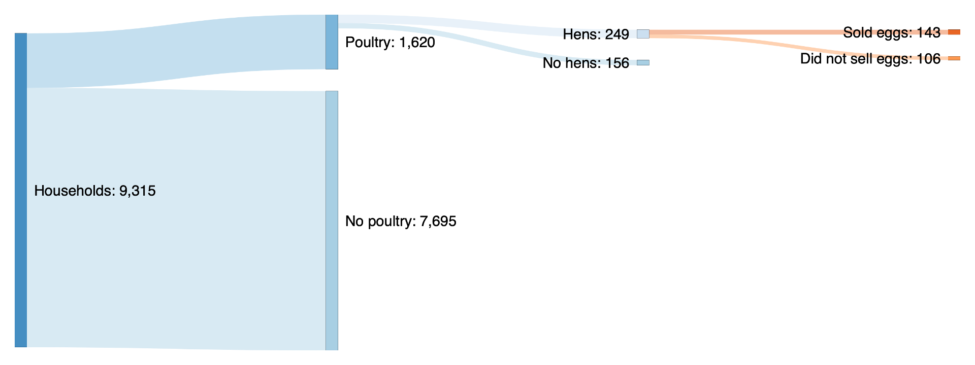
How many households have hens in rural Tigray Ethiopia? Of these households, how many have eggs? How many sell eggs?
As we examined consumer perception of egg consumption and explored strategies to increase feeding eggs to young children, I wanted to better understand household-level egg ownership. I examined the Living Standards Measurement Study (LSMS) 2015-2016, wave 2 data to visualize household egg ownership. It turns out, at least according to this data, that not many households have eggs.

How respondents describe the experience
As I read open-ended survey responses in a confidential case study, I realized that users were applying language unfamiliar to me. In other words, a reader unfamiliar with the case study’s brand would be unable to decipher the meaning of the open-ended survey responses. Curious about this observation, I wanted to measure its frequency — was I imagining this was more prevalent because it was unfamiliar? I ran an exploratory text analysis of respondents’ open-ended responses. The findings from this analysis are shown in the figure to the left. I was not overestimating the prevalence of the adoption of this language. The application of this language signaled that users were adopting the vocabulary of the brand, overwhelmingly.
Naturally, this left me with a few questions — is this adoption associated with user engagement duration, frequency of use, change in behavior?
Visualizing work status + income
Looking at General Social Survey (GSS) data, I was curious about work status and income levels. To very roughly visualize this information I created some exploratory plots. Although I like the look of the plot on the left (geom_jitter), I found the plot on the right (geom_tile) more informative. The plot on the right provides insight into the very general trend that households where the household partners both work earn higher household incomes. In my opinion, the plot on the left is nice to look at, provides insight into the number of observations (n = 1678) as well as the distribution of household partner work status (largely concentrated with both partners working full-time); however, the plot is too noisy to determine sufficient measures of income to compare across work status groups. Looking at the plot on the right we can quickly determine that according to the data collected, households with two full-time working partners have a higher household income than those with two part-time working partners or those with one full-time working partner and one part-time working partner.
Tight + loose cultures across the United States
In her book, Rule Makers, Rule Breakers: How Tight and Loose Cultures Wire our World, Dr. Michele Gelfand states, “Culture is like an iceberg… we fail to realize that formidable cultural obstacles lurk beneath the surface.” (p.142) As I was reading, I was curious – how are tight and loose cultures distributed across the states in the United States? Although Dr. Gelfand includes a map of this in her book (p.83), I wanted to play with the map and visualize it in color, for myself.
Tight and loose cultures: Who’s better off?
Looking at this same data from Rule Makers, Rule Breakers: How Tight and Loose Cultures Wire our World, I was wondering – among the states, who’s better off? In related research, Dr. Gelfand and Dr. Harrington dig into into differences as related to tightness and looseness across states. To answer the question, “who’s better off”, I examined well-being and used data from the 2017 Gallup-Sharecare Well-Being Index. I then graphed the relationship between each state’s tightness and well-being scores.
In her book, Dr. Gelfand dedicates a chapter, Goldilocks had it Right, to positing that the key to well-being lies somewhere in the middle of the tightness-looseness among cultures – a Goldilocks Principle for the strength of social norms. (p.196) After digging into the data across states in the US, it appears that her Goldilocks Principle for the strength of social norms may (loosely) apply, although perhaps it’s a bit skewed towards looseness.
If you’re wondering what that state in the top middle is, it’s South Dakota. And the loose state with a nearly equal high well-being score is Vermont.

Health + life satisfaction
Exploring Behavioral Risk Factor Surveillance System (BRFSS) 2013 data, I was curious to learn – is respondents’ reported level of health correlated with respondents’ reported level of life satisfaction?
After exploring the data, it does appear that general health may be correlated with life satisfaction, as a larger percentage of respondents who reported to have poor or fair general health also reported levels of life satisfaction as very dissatisfied and dissatisfied (47.5% and 54.4% respectively), while fewer respondents with reported excellent or very good, levels of general health reported levels of life satisfaction at the dissatisfied and very dissatisfied levels (6.8% and 15.6%, respectively).
Seasonality and consumption (in North Carolina)
Historically, I’ve worked in contexts where the diet is greatly influenced by the season. Looking at the Behavioral Risk Factor Surveillance System (BRFSS) 2013 data I was curious – would I see a similar trend? To begin to explore this question, I chose a state, North Carolina, and a given level of health status, “good or better health”. Given North Carolina residents’ access to grocery stores, I did not suspect that I’d observe a seasonal difference of consumption of fruits and vegetables. After looking into the data, it appears that my suspicion was accurate – among adults with reported good or better health levels in North Carolina, the average reported produce consumed appears fairly consistent throughout the year (overall average of 320 – which seems like a lot!). It does not appear that seasonality affects produce consumption among adults with good or better health status in North Carolina.

Original data visualization from Economist article
Redesigning a data visualization from the Economist
This visual features a real world case study assignment from the NYU data visualization course. The assignment specifications included: reverse engineer a failed visualization, apply organization and hierarchy to numbers, scale the country data, successfully chart statistics, integrate a map or diagram, apply keen sense of color distribution.
My reverse engineered visual applied the colors from the article’s visuals (I used the app Sip to determine the exact colors), incorporated outlines of each country, and emphasized the difference in GDP between the poor and rich, as shown by measurements from 2000 and 2015. I also extracted what I saw as key relevant quotes from the article. I felt that together my redesign more closely aligned the visual with the larger story.
The full Economist article can be found here.

Visual from the Economist article

Visual from the Economist article

Redesigned data visualization